This website has been evaluated in terms of Information presented and Design.
Intended Audience
The ‘who we are’ page reveals key statistics which gives an overview of the size of the organisation, and not just each centre. Parents will be reassured that any centre will be a positive choice. The landing page for ‘curriculum’ appears not detailed and the picture which seems to contain hotspots actually do not. But the next page will be of interest to the parents with more information on their trademark programmes. Showing a timetable on the following page ‘our typical day’ is also useful as parents will know when to pick up their children. ‘Our Centres’ locations are presented neatly according to regions in tables. However, the larger size of the map and list of centres directly below. will cause the user to resize the magnification of the map if cursor happens to be on the map when scrolling down. Maybe each region should have its own link to click and view the table. The ‘360 virtual tour’ only showcase the interior of 3 centres (probably the nicest/ newly renovated ones) this might give parents similar expectations for the others.

Site purpose
The logo of star learners fulfil its purpose by having the words ‘child care’. The three pictures on the landing page showcase their students in the centre’s uniform engaging in indoor and outdoor activities. Unfortunately no ‘enrol now’ button is seen.
Accuracy-Credibility
All three sites do not have explicit spelling or grammar errors, highlighting accuracy achieved by proofreading the content multiple times.
This also adds credibility to the site along with up to date/ recent media coverage.
Star Learners: This site has a ‘media’ page containing latest news and interviews by reputable media. Clicking on the face-book link on the top-right will lead to their facebook page with
information updated only a few hours ago. With greater accuracy brings more credibility to the site and parents will have more confidence in making the right decision for their child.
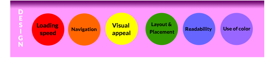
Loading speed
The loading speed of each is fast and acceptable. Tested by clicking on the logo to reach the landing page.
Navigation
The website also employs a drop down navigation bar, however it has a lag time to appear. The links on its landing page is not that intuitive, due to its colourful background, and where the links on the images will lead to is also unclear. There is also a broken link after ‘our belief’ page; clicking ‘a note from MD’ brings the reader back to home page. An extra feature found is ‘site map’ accessible through the footer nav bar, which contains links arranged in alphabetical order.

Visual appeal
The website has photos of children in their uniform similar to their logo. Together with the preferred blue color background, it has manage to achieve a form of visual consistency. However this design has lower visual appeal in the vibrant sector of childcare.
Layout & Placement
The layout of gives users an initial wide/open feeling as the colors occupy the entire browser. The layout of each page is also relatively simple with added feature of ‘next page’ button to guide the parent to what they want them to view. Their facebook link near the top right found across all pages guides the parent to click and view the latest information updated on their facebook page daily. Their main nav bar can be slightly more spaced out for easier clicking and reading, similar to the repeated bar at the footer.
Readability
Aside from its landing page, the readability of Star Learners is good due to its white background and dark font. The text is attractive in part due to the clean layout. The font size can be increased in its landing page.
Use of color
The first image of with the multi colored hands is attractive and shows fun in school. As mentioned previously the color theme matches their logo which makes the site plain looking. More colourful doddles akin to their logo could be added in the plain white space to give a sense of playfulness.