This website has been evaluated in terms of Information presented and Design.
Intended Audience
The Programmes and Curriculum section is brief and not categorised into the specific age groups. The lack of information may make a parent lose some trust in it. The ‘Discover’ page has a ‘foreword by founder’ giving parents an insight into the management’s view. The ‘Centres Location’ page in Carpe Diem displays an image map with links to the four regions of Singapore. After clicking which area you live in, the list of centres is shown. However the map disappears and if you want to click on another region you will have to navigate via the menu on the left. By clicking on the link to each individual centre, there is a write-up on the centre and facilities available, however the pictures are small and unclear. The ‘testimonial’ tab appears to be empty for all and should be removed. Despite many photos in the photo album, some are blur and not recent, resulting in poor advertising for each centre. A redeeming feature of this site is ‘Parent Resources’ containing free material that are useful to understanding their child.
Site purpose
The green tree-like logo of Carpe Diem does not represent a child care centre. Its landing page aside from showing images of children, does not have the overall feel of a child care centre website. However the presence of ‘enrol now’ link on its left menu bar is in line with purpose.
Accuracy-Credibility
All three sites do not have explicit spelling or grammar errors, highlighting accuracy achieved by proofreading the content multiple times.
This also adds credibility to the site along with up to date/ recent media coverage.
Carpe Diem: Aside from having a (good content but blurry) corporate video, there is no latest news or happenings for this organisation.
More up-to-date information could be showcased on this site to prove that it is updated to 2017 as indicated.
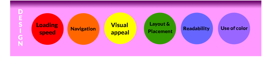
Loading speed
The loading speed of each is fast and acceptable. Tested by clicking on the logo to reach the landing page.
Navigation
The top navigation bar of website employs horizontal tabs when hovered over, which appear under the bar and can be confusing when viewed.

Visual appeal
The images are more faint in color probably due to resizing or the lack of professional photography. All text are shown on a yellow template which fails to maximise the use of the width of the browser window. The slow rising (of outdated) information in the ‘news & announcements’ window does not help in visual appeal.

Layout & Placement
The layout is also uniform in each web page of the site. With a simpler design and less vaired elements that require complex positioning, the web pages are abit plain. An entire image is used rather than doing element positioning, and the text in the footer is slightly misaligned.
Readability
The readability is good due to dark san serif font on light background. Unfortunately the repeated font type across the various pages makes reading boring after awhile, and may lose the attention of the reader.
Use of color
The green and black colors of Carpe Diem gives a relax feel to the web page. Overall the colors are pleasant and there is no clashing of colors.