This website has been evaluated in terms of Information presented and Design.
Intended Audience
With an intended audience the parents of young children, the ‘About Us’ page clearly states the company’s vision and mission as well as important certification. Another area parents will be interested is the curriculum their child will receive. This is being presented under ‘our curriculum’ and ‘enrichments’ pages with relevant information separated into different age groups. The parents will also want a centre that is nearby their home. The ‘centres’ page with photographs of the centres makes the centre familiar when they visit. Icons below each centre’s address should be explained, as parents will be worried if the centre does not have any.

Site purpose
On the landing page there are 3 photos which change automatically. The image of the MP does not give the impression of a child care centre. The image for enrolment should show a more relevant picture – children playing in class for example. The first picture shows children posing outdoors, not inside the child care centre, hence the parent might mistake it as a school outing. Finally, the logo does not show that it is a child care centre, more of a ‘learning place’ or tuition centre.
Accuracy-Credibility
All three sites do not have explicit spelling or grammar errors, highlighting accuracy achieved by proofreading the content multiple times.
This also adds credibility to the site along with up to date/ recent media coverage.
Just Kids: Hovering over the link ‘media’ brings up media tab that has only past years’ news. This shows inaccuracy as latest news regarding
the childcare sector is not reflected. It could publish some articles about their events held this year in this tab to increase credibility,
rather than just ‘recent photos’ of children in the bus.
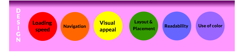
Loading speed
The loading speed of each is fast and acceptable. Tested by clicking on the logo to reach the landing page.
Navigation
The navigation of website is smoothest with drop down tabs and links clearly indicated when available.
Visual appeal
This site does well in visual appeal in part due to its user-friendly navigation; things that work better look better. All their images are clear, featuring lively children and have matching text.
Layout & Placement
The layout of the website is neat with equally spaced margins between the well-spaced elements. The paragraphs and headings are uniform and well positioned.
Readability
Readability is enhanced due to its well-placed box model. Unfortunately the white background and light colored font makes reading the long text abit tiring.
One highlight is the embedded links with layers on the curriculum page, which make reading ‘Six Learning Domains’ convenient for readers.
Use of color
The white color background used is non-distracting and allows focus on the text for the intended audience. Using less opacity, a more playful background with kids doodles can be used in the larger white spaces to showcase the fun children will have whilst in school.